Subject: Marine Geospatial Ecology Tools (MGET) help
Text archives
| From: | Sergio Marchant <> |
|---|---|
| To: | |
| Subject: | [mget-help] How to create Hovmoller plots and other figures |
| Date: | Thu, 1 Jul 2010 11:27:49 -0400 |
Dear Dr. Roberts, I am a Biological Science graduate student, and I am new using ArcGIS and the Marine Geospatial Ecology tools, however I am progressing quickly thanks to the excellent supporting documentation and examples. I would like to know if it is possible to create a shaded Hovmoller plot that describes monthly average values in the x axis (time) and other parameters (i.e Sea Heigh, Winds, currents, Chlorophyl, Sea surface temperature) in the Y axis . I already download monthly average data that I need in hdf and ncdf from several satellites and I thanks to MGET I can import the data in ArcGIS, however I am having trouble in figure out how to display all this information (temporal trends) in a scientific summarized way. Here are some examples of figures that I would like to include in my research. Thanks in advance. 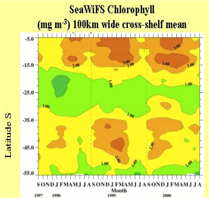 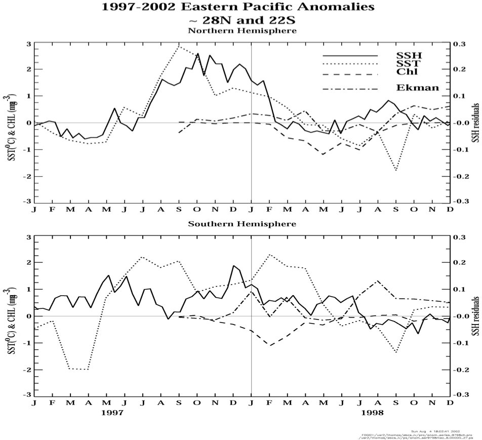 Sergio Marchant |
Archives powered by MHonArc.